4 mistakes to avoid with data
Happy Friday morning, friends and colleagues!
The opportunity has come. Your manager has called you. She/he wants to use your skills in making a complex analysis to make some critical decisions. You are excited about the project, and you are confident because you know you got this. Working in the supply chain, we’ll all have such opportunities.
Over time, I noticed my approach to make complex analysis had flaws. I’ve made the same mistakes repeatedly, but over time I figured out the counter-actions, requiring both technical and non-technical skills, that help me save a lot of time and produce a higher quality of work.
Four mistakes when working with data:
Rushing to complete before thinking about the task
Crunching numbers before visualizing the data (histograms, time-series charts).
Asking for the feedback too late.
Not validating numbers at least three times.
1) Rushing to complete before thinking enough about the task
Rushing happens due to the excitement about the work. By attempting to get things done or see results quickly, I often lost my way and ended up in the wrong place. I had to re-do most of the steps and sometimes the whole task. Why? Because I haven’t thought critically enough about the task.
The most crucial step is to think about the objective and how to reach there. My dad, retired now but worked 30 years C-level, gave me great advice one day. He said the time you spent on thinking should be greater than the time you spent doing the actual work (modeling the data and analysis). When you think enough about the task, you can break down the most optimum steps required to reach the end goal.
2) Crunching numbers before visualizing the data
Visualization will help you:
Understand the dataset’s distribution, quickly notice trends, seasonalities, and identify outliers (so you can clean the data ahead of time).
Provide you with a holistic view of the data so that you can almost approximate the outcome or range of results before getting your hands dirty with data.
Save a lot of your time and provide you the confidence if you go in the right direction.
Visualization tools you can use on spreadsheets:
1) Frequency Histograms will tell about the distribution of the data and show the outliers.
Let me demonstrate this with an example.
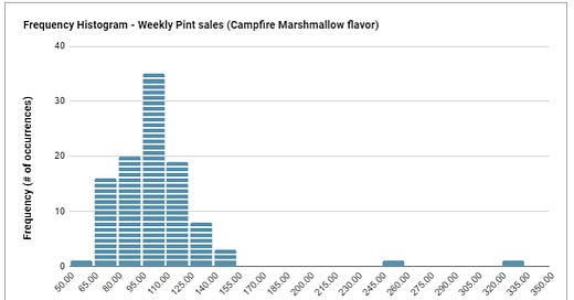
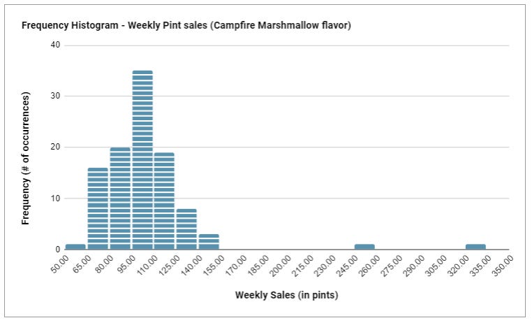
Suppose you manage the supply chain of an ice-cream shop. You want to review the demand for the top-selling flavor Campfire Marshmallow - so you can plan inventory and supply. You have two years of weekly sales data (total 104 weeks). You decided to create a histogram to understand the distribution.
Takeaways from the frequency histogram:
Horizontal axis: unique weekly sales in pints
Vertical axis: the frequency of these sales (within 104 weeks)
The most frequent weekly sales are between 95 and 110 pints - which occurred about 35 times out of 104 periods.
At the far-right, you will notice the outliers. Very high weekly sales, far from the area where data is condensed, occurred twice. It would help if you investigated these with the sales team to validate. They could even be a data error. You should not include these in the analysis as they are misleading.
The majority of the weekly sales are between 65 and 125 pints/week.
There is one remarkable example that demonstrates how outliers distort the averages. Suppose there are ten people in a bar, each earning $35k annual income. The average yearly income for this group is $35k. Now Bill Gates entered the bar, and he has an annual income of $1 billion. The average annual income for the new group (11 persons) is now $91 million. Although this is statistically correct, the latest yearly average income will be inaccurate and will not represent the bar’s actual average annual income. (There are many versions of this story online, and this version is from the book “Naked Statistics,” written by Charles Wheelan).”
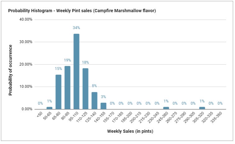
2) Probability Histograms will tell about the distribution in terms of probability (%) instead of the number of occurrences.
Takeaways from the probability histogram:
What is the probability that sales will be between 95 and 110 pints a week? 34%
What is the probability that sales are over 125 pints/week? 13%, including outliers.
What is the chance that sales are equal to or under 80 pints/week? 16%.
Last week, I wrote about how important it is to master and speak percentages. Everybody can understand and make sense of what’s going on when you explain the data in percentages vs. as standard data points.
3) Time-series charts will represent the progress of the data over time and capture seasonality and trends.
Let’s continue with the ice-cream example. You already checked and have an understanding of the distribution. You cleaned the data, created the Q1 forecast, and graphed the below time-series chart.
3) Getting feedback too late
Often, we want to impress our managers; we’ll tend to hide what we’ve done until the last minute. Then comes the disappointment. Frequent feedbacks will keep the work on the right track, and the output will be in the expectations of your manager.
Get feedback as early as possible. There is nothing wrong with asking for feedback.
4) Not validating numbers at least three times
When you present the results to your manager, the first question will likely be if you have double-checked the numbers?
The truth is after spending so much time on it, during those final steps, you may easily miss simple errors as you are looking too closely at your file. When there are many moving parts and manual inputs, the data and the file can get messy even if you are organized.
Therefore, validate the numbers at least three times, or even ask a colleague to check a final time.
These are the 4 points that I focus on getting better at each time there is an opportunity. You can access the Google Sheet link here to view how I made the histograms.
What are some tricks and techniques that work for you? Please share them in the comment section!
Thank you for being part of the supplychainist and have a great Friday :)
If you liked this issue and found it valuable, consider sharing it with friends or subscribing to it.


